
Role: Sr. Product UX Designer
Timeline: 1 week (Checkout UX Analysis/audit)
Users: Business Owners
Team: Head of Marketing, Senior Digital Analyst, Jr. Business Analysts
Challenge
There was no clear problem statement, no success metrics, and no access to any design files and no documentation. I had to start from scratch, analyzing analytics and facilitating a workshop with stakeholders to define success.
Core Problem
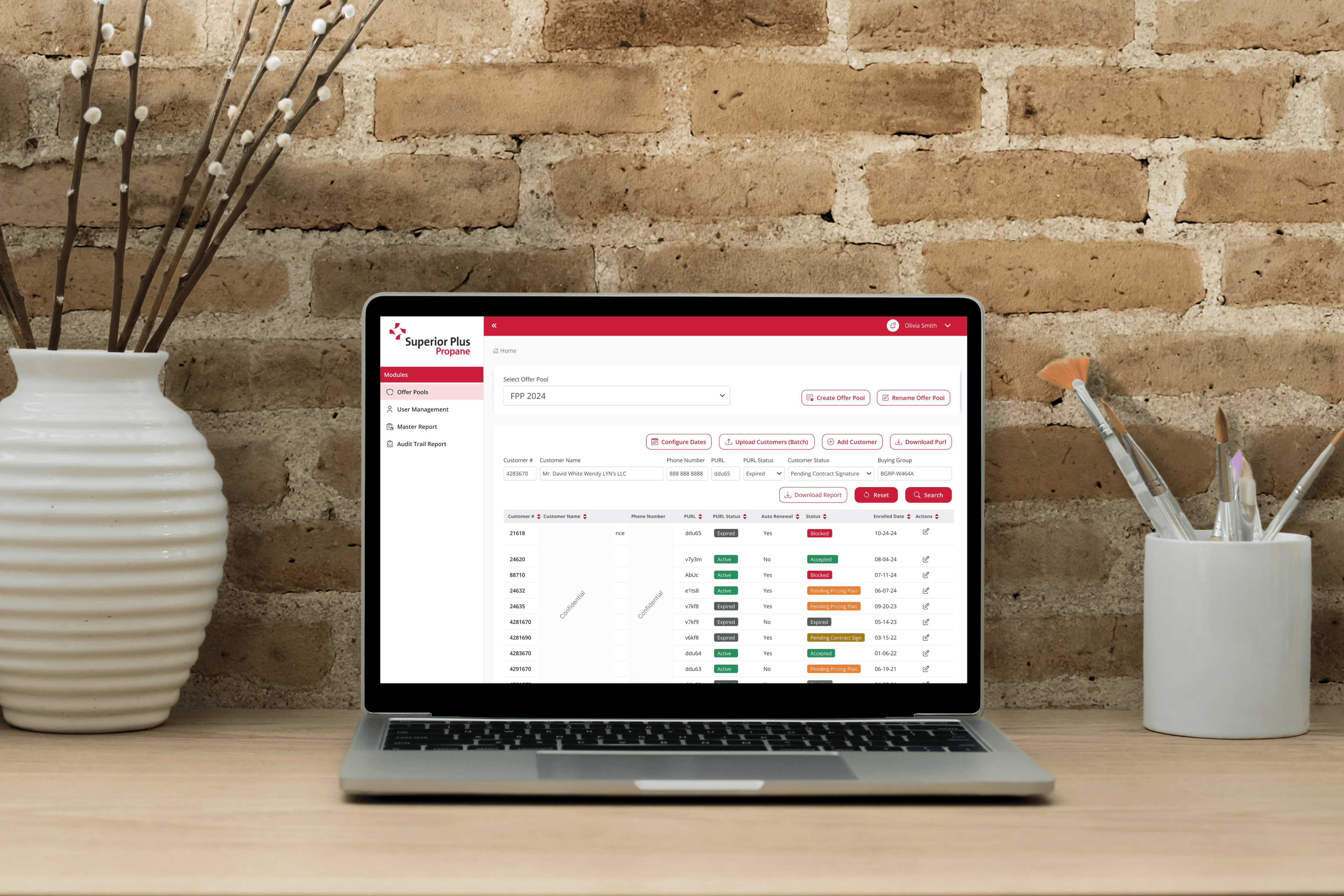
The Samsung Canada Business website was experiencing high cart abandonment rates, particularly on the desktop and mobile checkout flows. Business owners were leaving their carts before purchase completion, indicating pain points in the user experience that needed to be identified and addressed.
Impact
I uncovered critical UX friction points in the checkout flow such as cluttered forms and unclear error messaging and proposed targeted improvements grounded in Nielsen Norman Group heuristics and Baymard Institute benchmarks. These changes streamlined the process, minimized cognitive load by reducing form fields by 30% and clarifying next steps, and eliminated 'annoying' interruptions like redundant verifications.
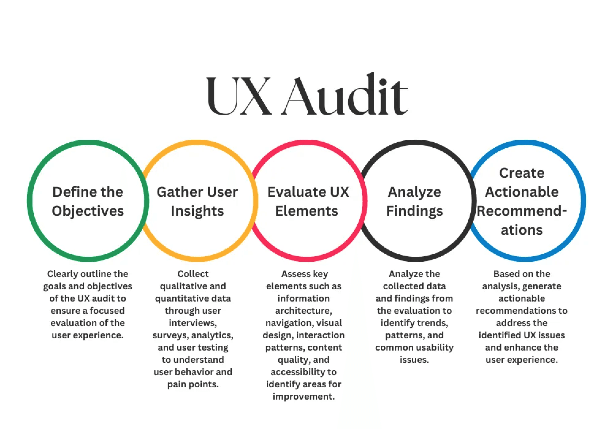
As the solo UX designer, I led a structured heuristic evaluation using Nielsen Norman Group principles and Baymard Institute benchmarks, following these steps:
Analyzed provided by analytics data from head of marketing revealing 65% cart abandonment, with 43% drop-off at the shipping step and 25% at payment step
Tested flows on desktop (primary for B2B users) and mobile, noting 70% of sessions originated from desktop but 30% mobile users abandoned faster due to touch targets;
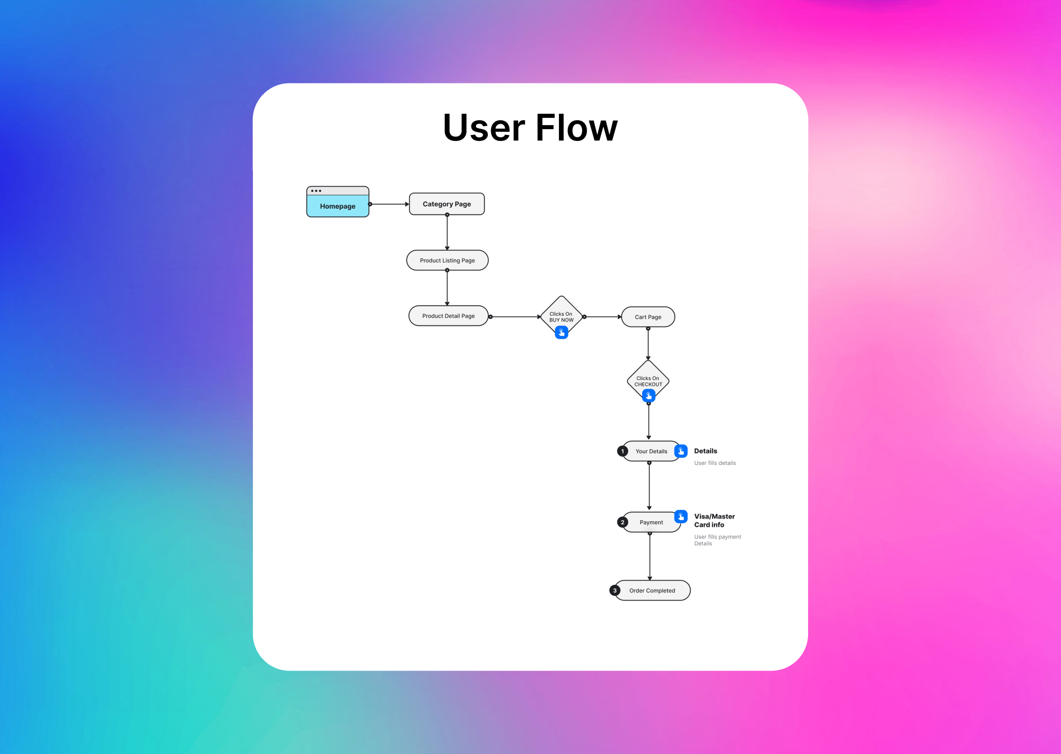
Screen-by-screen walkthroughs with annotated screenshots to map the full checkout journey
Prioritized issues by severity (high-impact blockers first)
Compiled recommendations into a stakeholder-ready report with visuals and rationale.
Key Findings and Improvements during UX Analysis
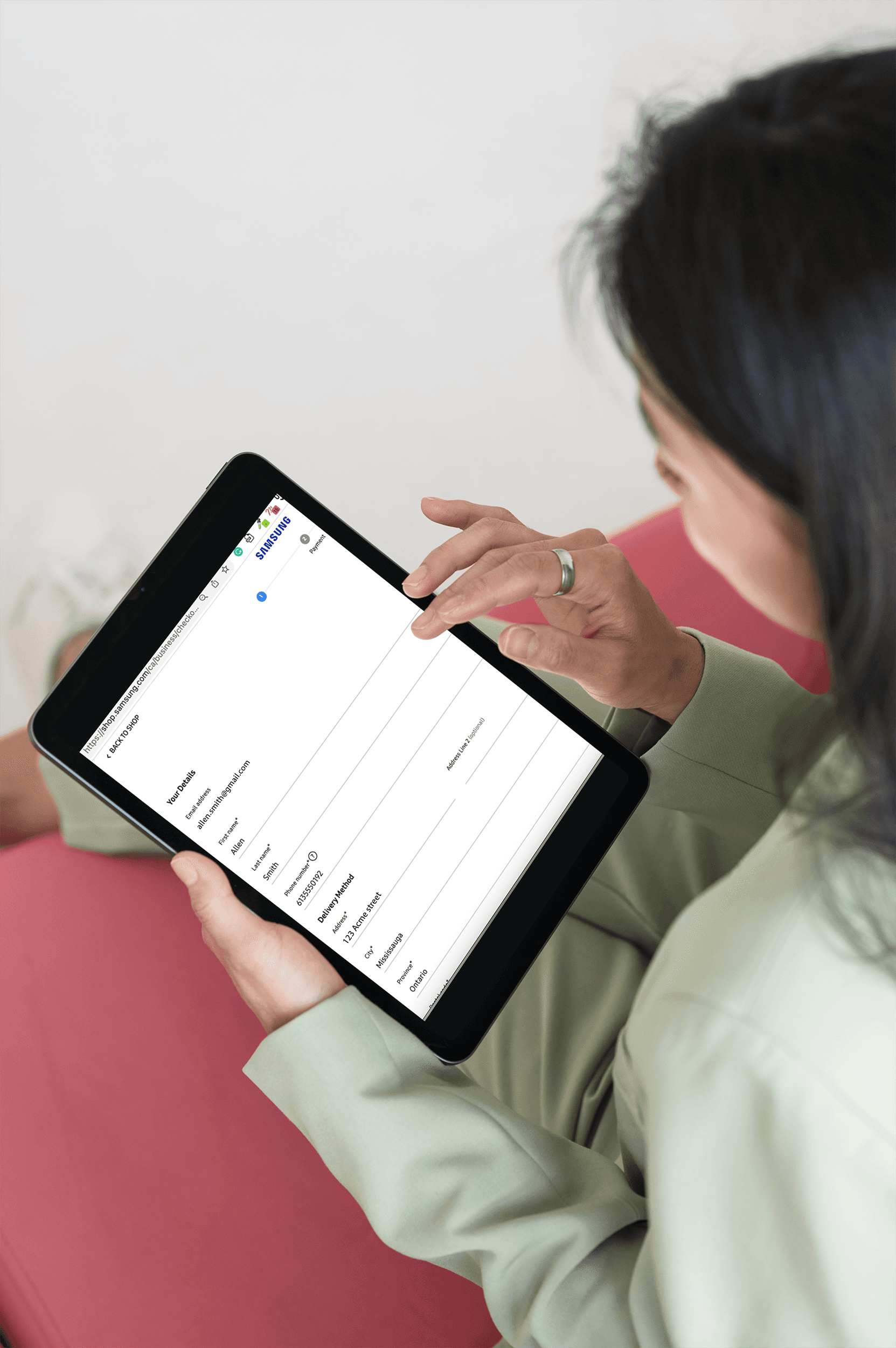
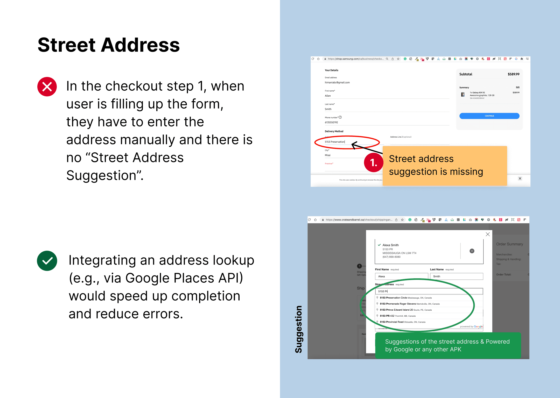
Manual address entry increases friction:
Users are required to manually type their full street address instead of using an address autocomplete service, adding effort and increasing the risk of typos and failed deliveries. Integrating an address lookup (e.g., via Google Places) would speed up completion and reduce errors.
UX Best Practice Article on Address Lookup:
https://baymard.com/blog/automatic-address-lookup
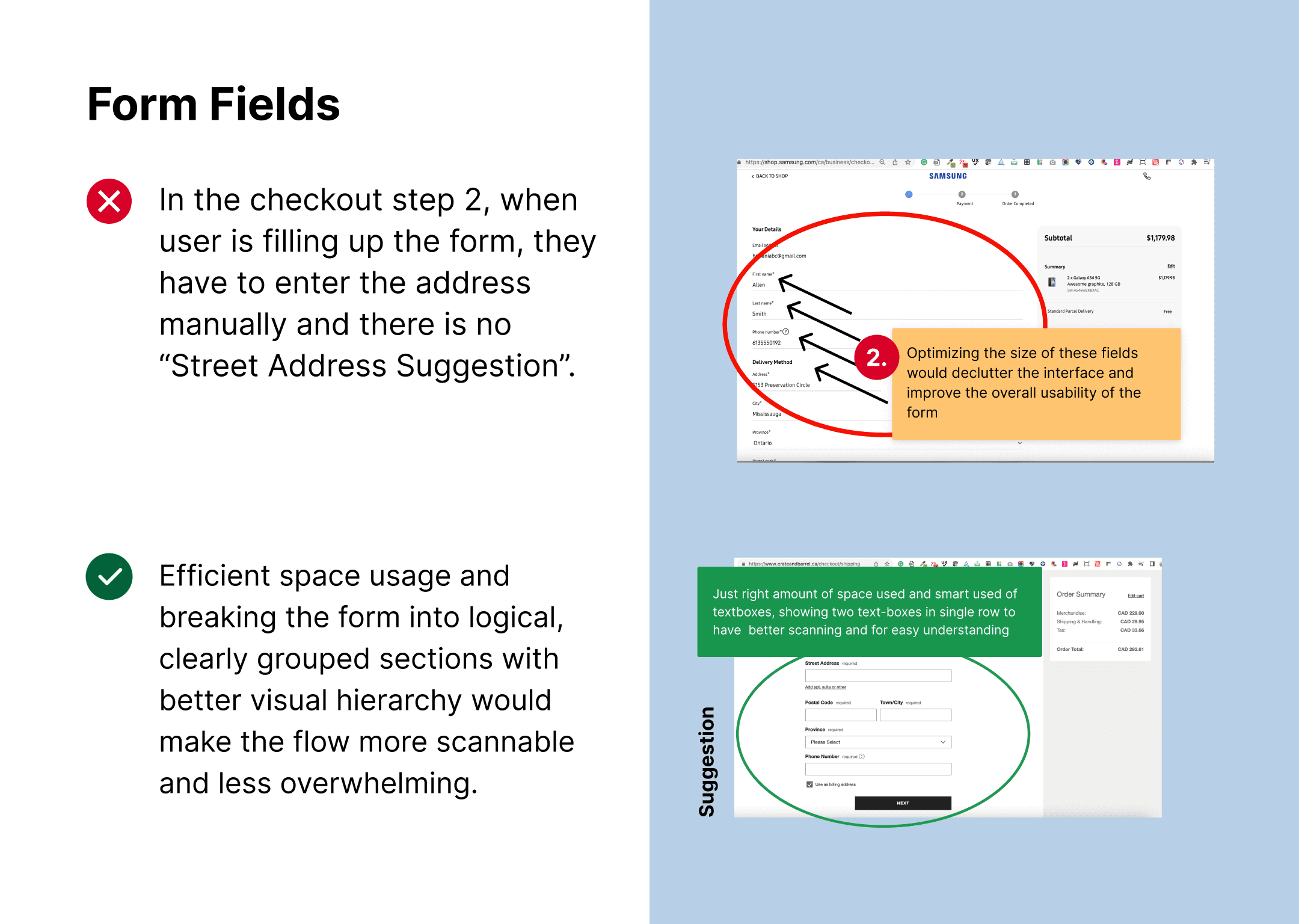
Full-width, wall-of-form layout:
The checkout uses a full-page-wide form, which forces users to scan in a confusing Z‑pattern and makes it harder to know where to start and what to do next. Breaking the form into logical, clearly grouped sections with better visual hierarchy would make the flow more scannable and less overwhelming.
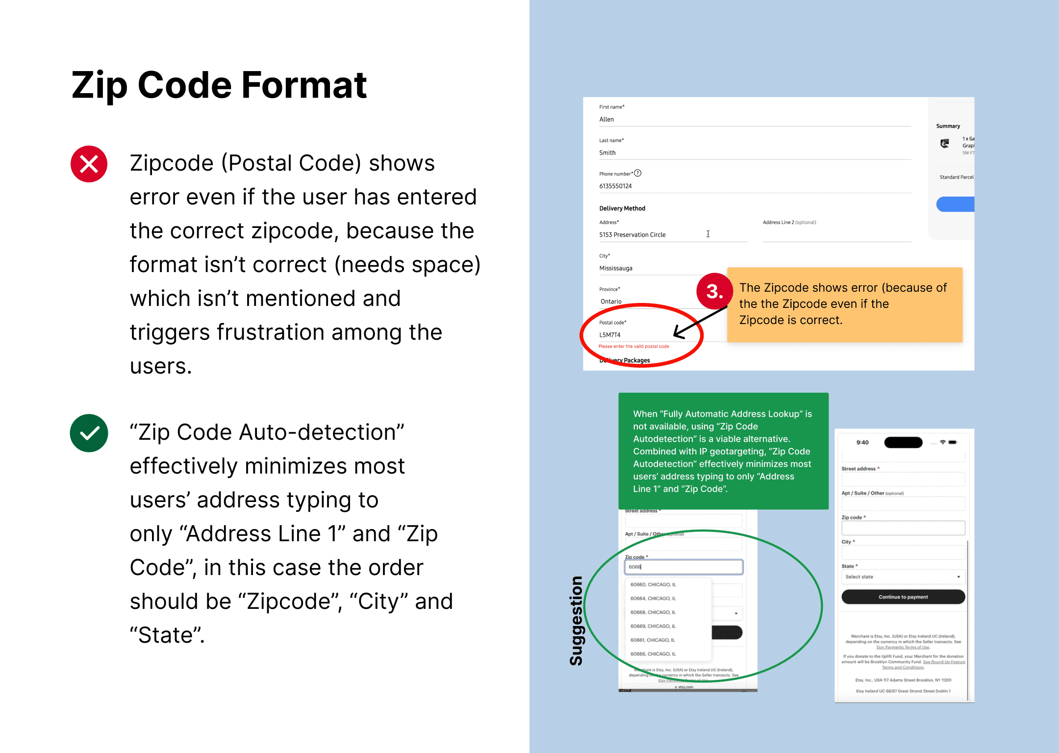
Zip Code Errors:
Unspecified format triggered submission failures without inline guidance. Adding real-time validation and format hints with the space in between (e.g., 'L5M 7T4') as tooltip shall cut errors by 50%. This option does not require any automation or any extra efforts on code level.
UX Best Practice:
https://baymard.com/blog/zip-code-auto-detection
Have “City” and “State” Appear beneath the Zip or Postal Code (As per suggestion on the below image)
- Combined with IP geotargeting, “Zip Code Autodetection” effectively minimizes most users’ address typing to only “Address Line 1” and “Zip Code”.
- Despite of unconventional sequence/order of the fields Zipcode -> City -> State, it was observed to be negligible compared to the gains in completion speed, user efficiency, and reduced typos.
- Always have a fallback for autodetection ("Zip Code Autodetection” is a great fallback option for sites that don’t provide “Fully Automatic Address Lookup”)
- Autodetect immediately after the last digit is typed
- Prefill zip or postal code when possible
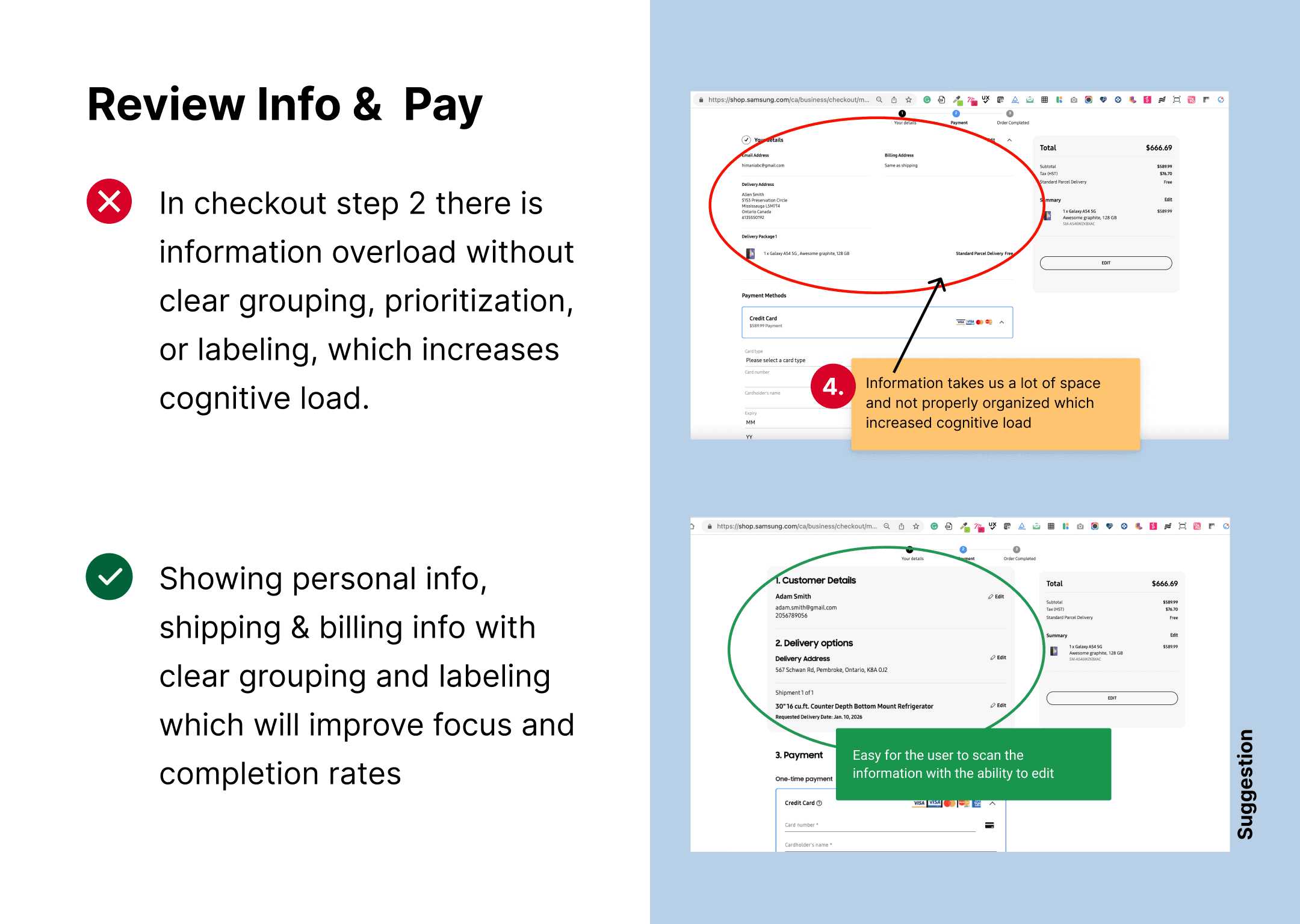
Information overload on a single step:
Too much information is displayed on the left in checkout step without clear grouping, prioritization, or labeling, which increases cognitive load. Structuring content into concise sections (Personal info, Shipping, Billing) and reducing non‑essential elements would improve focus and completion rates.
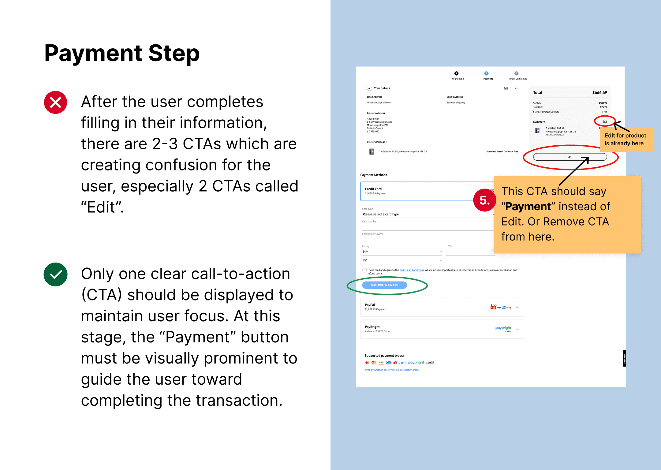
Confusing CTAs:
Phone icon appeared clickable but wasn't, misleading users, redesigned with clear, labeled buttons (e.g., 'Call Support') and hover states for affordance.
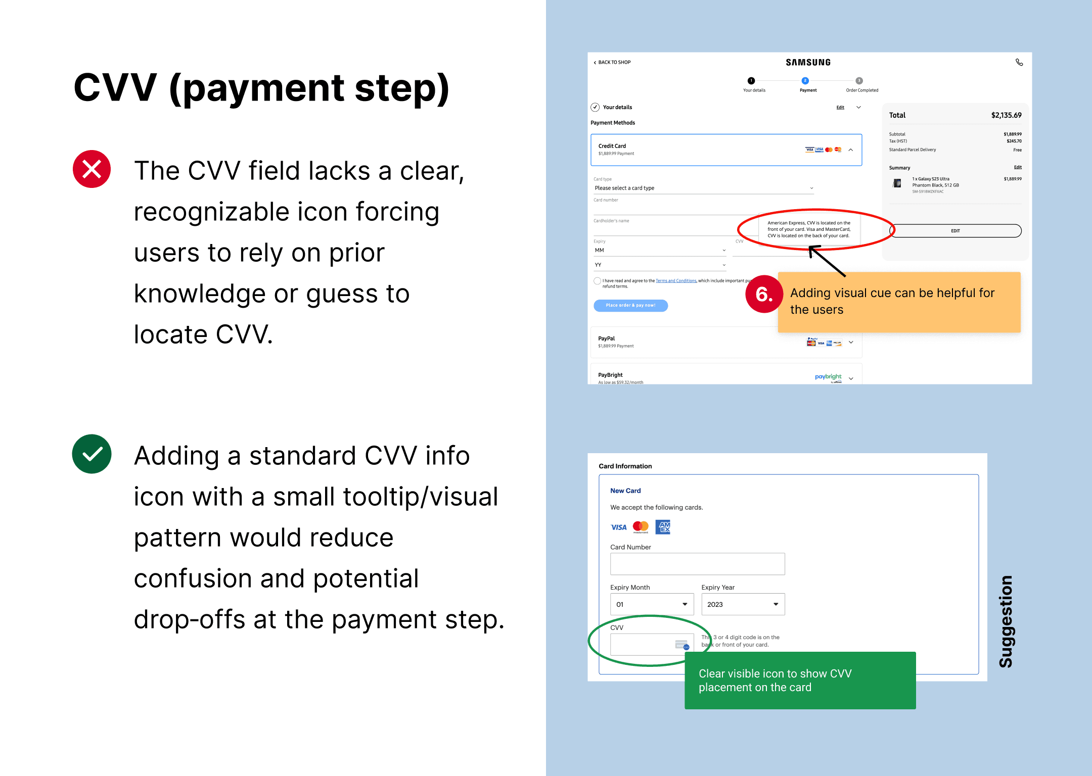
Unclear CVV help affordance:
The CVV field lacks a clear, recognizable icon showing where to find the code on the card, forcing users to rely on prior knowledge or guess. Adding a standard CVV info icon with a small tooltip/visual pattern would reduce confusion and potential drop‑offs at the payment step.
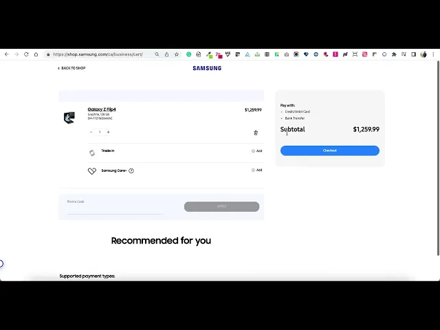
The product quantity resets unexpectedly, the “Recommended Products” section displays no items, and clicking the checkout button takes the user back to the start of the checkout process.
Product Quantity:
Clicking 'Edit' on checkout quantity sent users back one step to re-edit, then restarted the entire checkout process (showed below in this gif/video). Cart displayed only 1 product (1 device) despite adding 2, causing confusion. Recommended to show the product availability on PDP or show out of stock if the product isn't available to inform user which helps user understand the stock availability.
Recommended Products:
Interrupting the focused checkout flow with cross sell/recommended products/unrelated offers creates friction and confusion, making users angry and leading to cart abandonment.
UX Best Practice:
Show "add-on" items on the order confirmation page (after payment) so users can add them with one click without re-entering payment info, reducing checkout friction.
Next steps
This task served with limited information, allowing me to demonstrate how I approach and deliver a UX audit. Learning:- Validate the highest-impact opportunities with data (e.g., analytics, usability testing, or prototype tests) before committing to full implementation.
Define success metrics (cart abandonment rate, checkout completion rate, error rate per step, mobile vs. desktop performance) to measure the impact of any implemented changes.
As of 2025, the checkout experience has been improved by incorporating several of these recommendations, paving the way for ongoing optimization rather than a one-time fix.
Future work could include multivariate testing of alternative flows, deeper personalization for business customers, and stronger integration between checkout, account, and post-purchase experiences.